Irish Artmart UX Case Study
The Irish Artmart is a platform for buying, selling and auctioning artwork that is created by Irish Artists.
Challenge
Redesigning a content-heavy art website into a pleasurable online shopping experience, that ethically maximises sales.
Goals
Reviewing and establishing working conventions from competitor websites.
Diagnosing pain-points and difficulties in the user journey.
Redesigning a trustworthy and user-friendly interface for purchasing artwork.
Where it began…
This project idea stemmed from the decision to sell my artwork online on the Irish Artmart.
When I first visited their website, to become a member, I immediately encountered a structure that was poorly designed. I am pretty tech-savvy and even I was getting lost within seconds!
“If we want users to like our software, we should design it to behave like a likeable person: respectful, generous and helpful.” — Alan Cooper, Software Designer and Programmer
The Irish Artmart fell short of being intuitive and helpful. This could be directly affecting the sales of my artwork.
Step 1. Research
Competitive Benchmarking
I wanted to better understand what competitor websites were doing, to enhance users shopping experiences. Competitive benchmarking is an opportunity to understand this, establish conventions, and discover gaps in the market.
What conventions work well on other websites that could minimise the learning curve on Irish Artmart?
What key features are included? Or just as importantly, excluded?
What are competitors strengths and weaknesses?
Main findings
The structure of categories on competitor websites were designed intuitively. I knew precisely where each heading would lead me. Irish Artmart lacked this feature. They created separate headings for very similar content e.g. art class & art workshop. A card-sorting project was definitely needed for Irish Artmart.
SingulART.com in particular revealed an order of importance within their layout. Artwork for sale & participating artist’s names lay at the forefront of their website.
Text hierarchy was notably missing from Irish Artmart. A small font type was consistent throughout their website. This made reading & scanning difficult and not accessible for all users.
Background interference was kept at a minimal across numerous of mainstream art websites.


Usability Testing - Diagnosing the problem
To collect qualitative observational data, from real-life people using the product, I ran usability tests. This was an exercise in empathy, to better understand the users experience and not how I THINK they experience the product. This reduced bias-based design.
“Like all forms of design, visual design is about problem-solving, not about personal preference or unsupported opinion.” — Bob Baxley
Can the user complete their task with ease?
Does Irish Artmart appear trustworthy to users?
Is it accessible for everyone?
What expectations does the user have?
Main findings
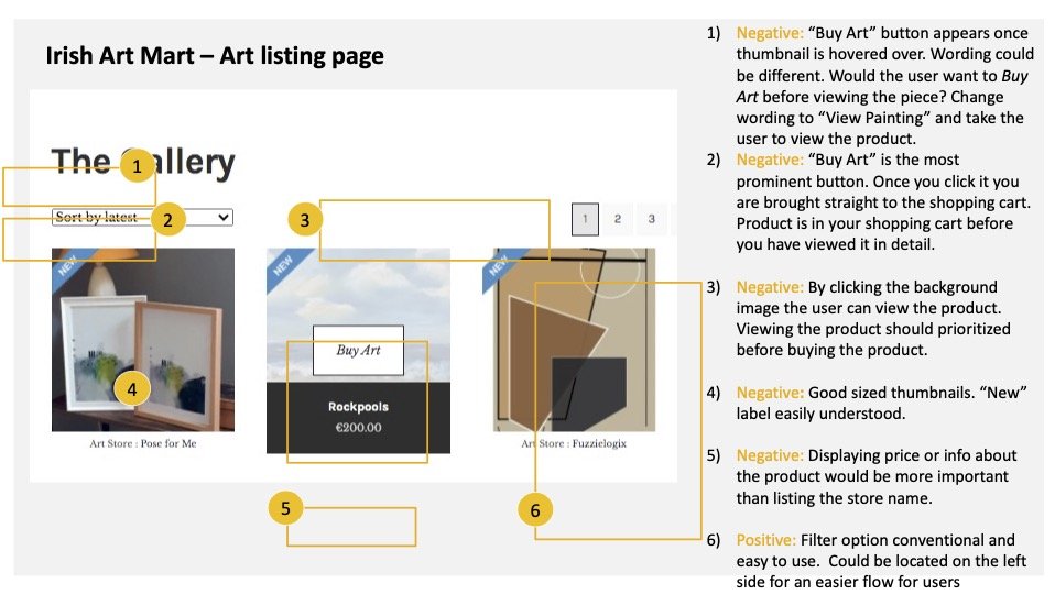
The main user struggle was the ability to easily view artwork. Again and again, the CTA button for viewing the product was overlooked by the user. This resulted in the art item being placed immediately in the users cart, before they had the opportunity to view it. Understandably, this created frustration. Confusion was evident. The user did not know where they were and where they were being lead. Users actions were limited without an explanation. This created an overall disruptive experience.
Card Sorting
A mechanism was needed to reorganise the confusing categories on the homepage. What was clear to me, might not be clear to the user. Using a card-sorting technique ensured the process stayed user-centred, along with providing insight into the attitudes and values of the user.
What makes sense to the user?
What expectations does the user have?
Main outcome
The new categories varied in comparison to the existing I.A.
Certain categories were viewed as duplicates, resulting in several headings. Independent titles were now sorted into the same grouping.
The end result showed purging of several headings.
For the next upcoming project I intend to use software such as UX Tweak to perform online card-sorting, to gain more quantitative data.

Step 2. Analysis
Defining the problem using an affinity diagram and customer journey map.
Affinity Diagram
The aim in creating this diagram was to logically arrange all collected data and determine. l the root of user issues. Unlike previous affinity diagram projects, I completed this task alone missing out on the diversity of ideas that can emerge from teamwork. It was a useful exercise to complete alone, because it allowed me to appreciate the contrasting value of communal work.
By grouping data, patterns soon became visible.
The website appeared to lack clear communication. The user was often uncertain of what “art” they were looking at. This was one of the main aspects that needed working on.
In this case, it is important to assume the user does not have a deep understanding of art. Design for the user, not for yourself!
While working on the affinity diagram it was sometimes difficult to find the right category for certain notes. In hindsight, behaviours, context and goals could have fallen under the same heading for a more refined diagram.


Customer Journey Map
As mentioned under Affinity Diagrams, design for the user, not for yourself. To ensure a truly customer oriented design is carried through, I created a Customer Journey Map. This overview prioritized the problem areas and gave me a better understanding of the users experience.
From the early stage of selecting a desired art category, on the homepage, and to the shopping cart, design efficiency waned. The first downfall identified was confusion around the art categories. The list of options was lengthy and unclear.
Selecting artwork was the next major pain-point and a costly one! What user wants to have a product in their cart ready to be paid pay for, before they know what it is?

Customer journey map, demonstrating the user experience from beginning to end of task.
Step 3. Design
Visualising the solution using a flow diagram & sketches.

Flow Diagram
The devil is in the details! Completing this diagram allowed me to iron out unnecessary steps taken by the user.
The log in/Sign-up screen no longer opens a new page but appears as a pop-up.
The new design guides users directly from the main art page to the sub category of their choice.
Unlike with the original version of Irish Artmart, I allowed the user to refine their search only when they had already selected a. category. Too many choices on the Irish Art Mart homepage was leading to confusion and clutter. It was better to allow the user take the process in steps, without becoming overwhelmed.
Sketching - Solution mode begins!
This stage of the project is all about putting pen to paper and developing fitting solutions. It’s an ideal method for refining details, created in the User Flow diagram.
Results
The effectiveness of sketching as a problem-solving technique was clear. It was quick, easy and a low cost method clarifying ideas. Similarly to previous projects, there were multiple iterations. Each draft unraveled a more detailed version than the previous.
The homepage must be conventional and familiar.
Navigation must clearly guide the user through to the next step. Do not presume they will figure it out.
Language must be concise and well communicated.
The user must be able to focus on their intended task, without being overwhelmed by distractions.
Prices must be clear. Let the user know what they are paying for.
Offer the user an easy way to rectify mistakes.
Provide sufficient information, showing the user where they are and where they are going.

Step 4. Prototyping
Designing the solution using a Prototype.
Prototype
My favourite part! Using Figma, I created a medium fidelity interactive prototype of the homepage, to the shopping cart.
Even at this late stage, small issues still came to light . I realised I had missed some micro-interactions, that were revealed through testing and designing the prototype.
Results
The homepage is clutter free, intuitively designed and closely following conventions.
The main user-cases appear in the top bar.
Categories have been reorganised and re-worded for clarity.
An in-depth filtration system has been added, to sort though large quantities of content.
Breadcrumbs were added throughout the website, helping the user know where they are.


Conclusion
I was personally invested in this redesign as I felt the current website structure was hindering my own potential art sales. I can happily say, backed-up by usability testing, that the redesigned webpage allows for a seamless, enjoyable shopping experience. It contains a user-flow that is intuitive and transparent. The goal of ethically creating a pleasant user-focused experience has been achieved. It allows the user to complete their task from initial searching for artwork, to successfully placing it in their shopping cart.
Opportunities for improvement
My new login/sign-up screen appeared to be task heavy. I redesigned it a second time. I should have identified this issue earlier in the project and sketched out more options for comparison, avoiding duplication for work. Early A/B testing would have been a fitting approach here.
The power of collaboration - For future projects, where possible, I will work as part of a team. Each individual brings a different perspective and invaluable attributes. This could be very beneficial for the Affinity Diagram in particular.